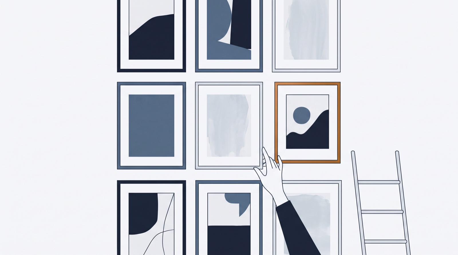
For a decade, “plan your grid” meant one thing: squares. Then Instagram went rectangular — profile tiles now crop tall (roughly 3:4) — and half the classic advice quietly died. Perfectly-seamed puzzle feeds? Beheaded. Border grids tuned to square margins? Off-balance.
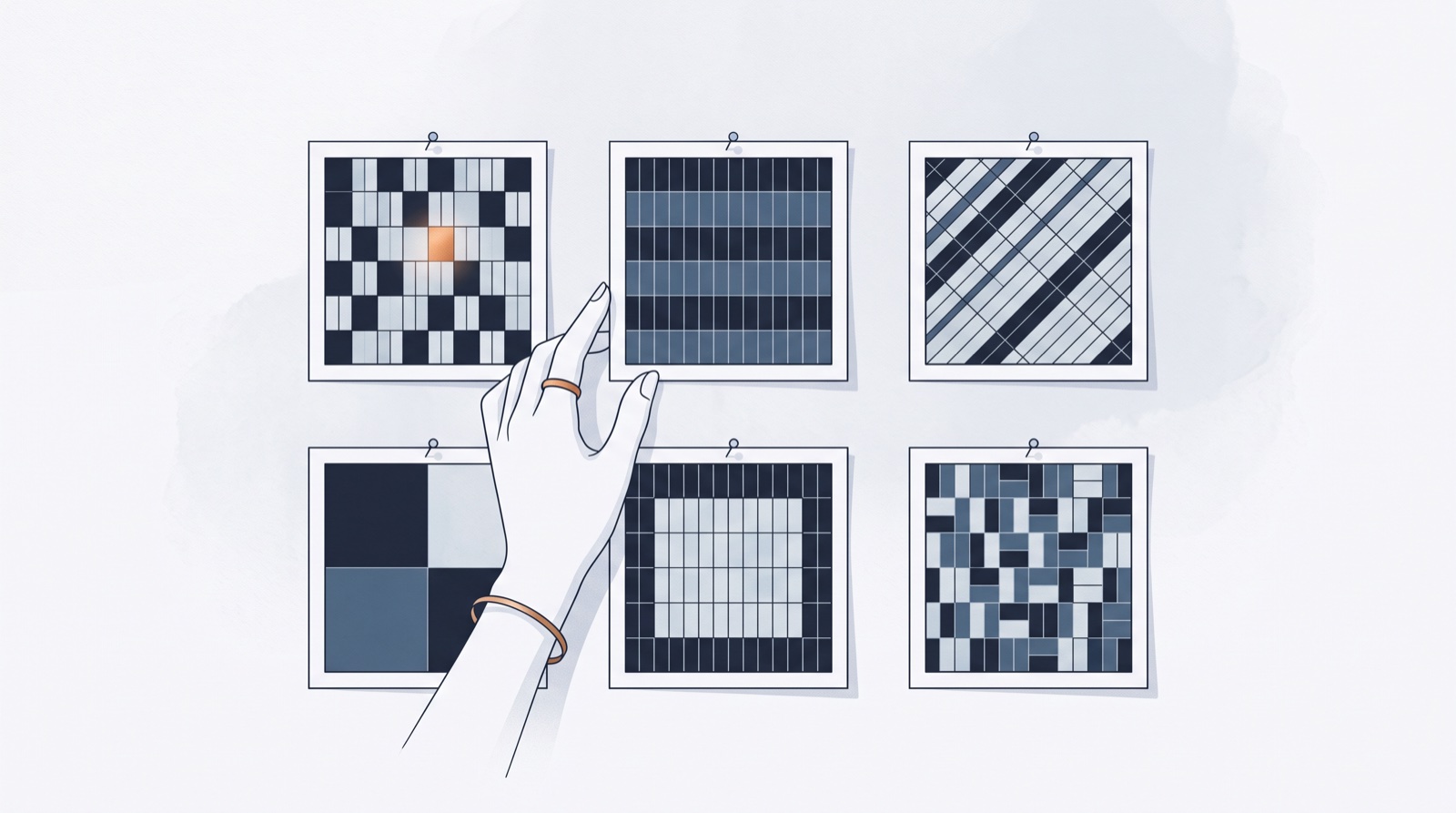
But the underlying craft — composing nine-plus tiles like a wall, not a pile — matters as much as ever. Here are the six patterns that survived the re-crop, and the honest cost of each.
First, the technical ground rules
- Design for 3:4, shoot for 4:5. Export 1080×1350; the grid shows a tall crop of it. Anything critical — faces, product, text — stays in the middle 80% of the frame.
- The grid is a crop, not the post. Followers see 4:5 in feed; strangers see the 3:4 tile on your profile. Both must work; neither is “the real one.”
- Reels covers count. A 9:16 Reel shows its cover in the same tall tile — choose covers with the same eye you choose photos.
The six survivors
A pattern is a promise. Only make one your production can keep.
1 — Row storytelling. Each horizontal row of three is a chapter: one project, one trip, one launch. Post in threes and the profile reads like a magazine spread. Cost: content must arrive in threes; odd posts break chapters.
2 — The checkerboard. Alternate two content types — photo / text-card, color / neutral, work / face. The tall tiles actually strengthen the rhythm. Cost: strict alternation forever, which is why it suits accounts with two reliable content streams.
3 — The anchor column. One vertical line (usually center) carries a recurring format — quotes, covers, behind-the-scenes — while the flanks stay free. The loosest commitment: every third post follows the rule, the rest breathe.
4 — Color blocking. Six-to-nine posts share a palette, then the block shifts — seasonal wardrobe changes for the feed. Works beautifully for product and fashion; requires shooting in editorial batches.
5 — The series frame. A repeating designed template (same border, type treatment) for one format only — tips, reviews, drops — instantly recognizable in the grid at thumb-scroll speed. Cost: template discipline.
6 — Hero and satellites. One statement tile (bold graphic, dramatic frame) surrounded by quieter neighbors, repeated every six-to-nine posts. The wall version of pacing: loud, quiet, quiet, loud.
Choose by production reality, not by Pinterest
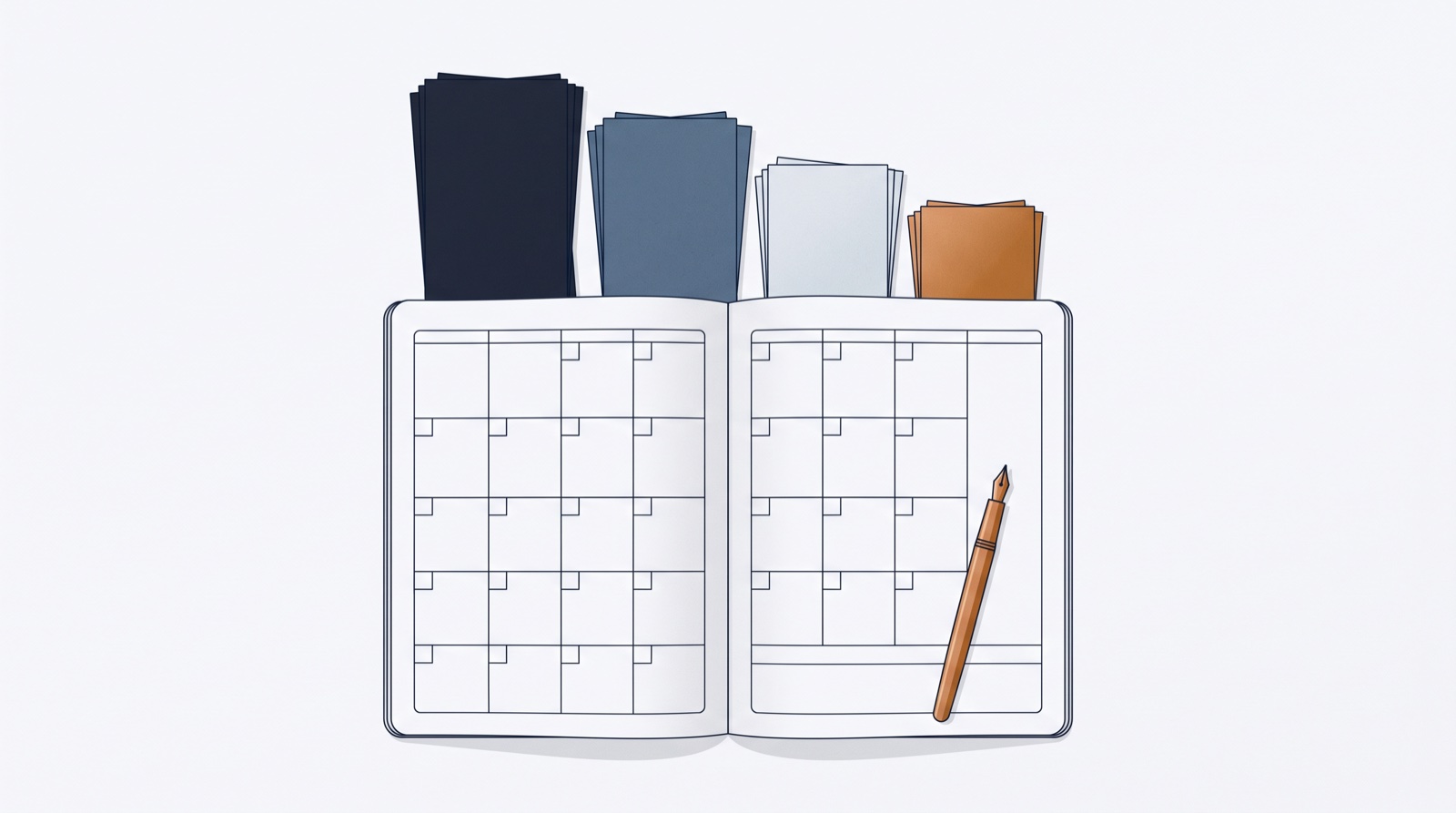
The failure mode isn’t picking the wrong pattern — it’s picking one your real month can’t feed. A photographer drowning in imagery can run rows or color blocks; a solo consultant posting three times a week wants an anchor column or series frame. If a pattern needs content you don’t naturally produce, it’s decoration, and it will break by week three (the day-nine problem, grid edition).
And if the wall is where you naturally start — visual-first planning makes the pattern the plan: compose the grid, then write captions to images that already have a mood.